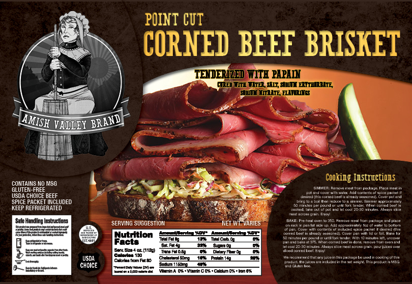
2012, Photoshop, Paint Tool Sai, Illustrator, InDesign. This is a design created in a Package Design class at O’More College of Design. It was created according to the exact specs and timeline of a prior real-world project, which included stock photos to choose from, the creation of a new logo, and the last-minute accommodation of a previously-existing logo. It also involved research of existing packaging for corned beef brisket.
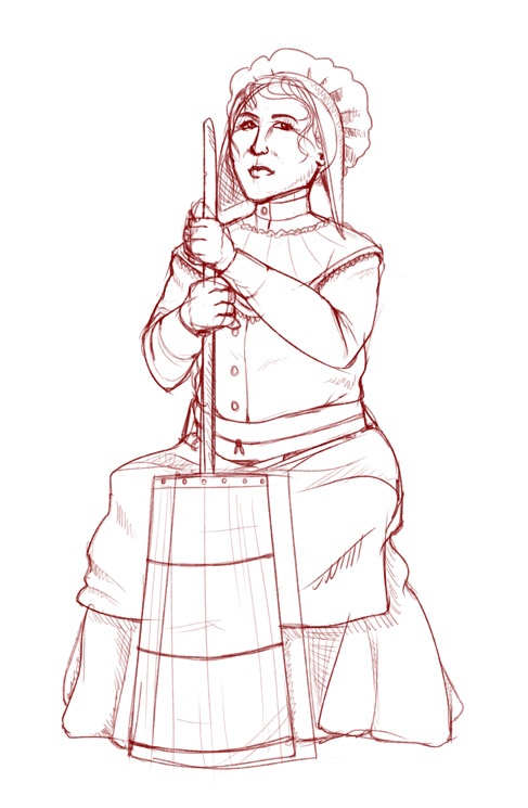
Here is the version with my logo (also seen below). The monochrome illustration of an older woman churning butter against the backdrop of a valley falls squarely within Amish imagery.
Through this project, I also became familiar with labeling requirements for food packaging, including information and the placement of said information.
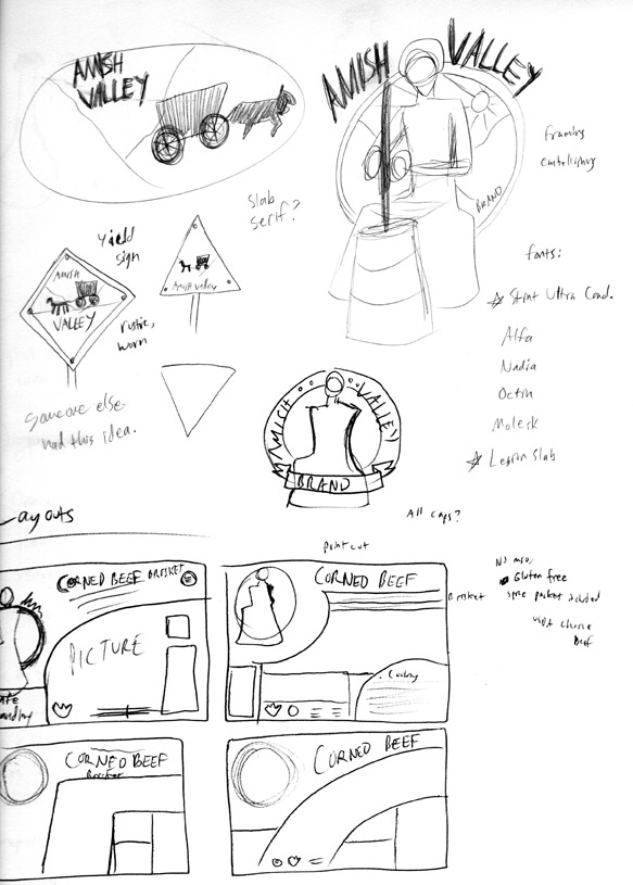
Some rapid thumbnail sketches were made to get out the basic ideas and run immediate logo ideas out of my head. Some quick layouts were also drawn with packaging requirements in mind. I wanted to make the layout non-square-based and dynamic without being confusing.

