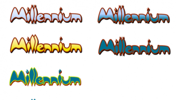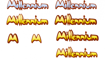
A logo for my now-defunct original online fantasy comic, Millennium.
For my senior portfolio in college, I decided to revamp the original logo I had made roundabout 2005. I made some more refinements recently as well to help contrast. Here’s some of the process:
Millennium is currently undergoing a huge and time-consuming overhaul, story-wise, art-wise, and site-wise, development-wise. One of the factors that has come up is the logo. Originally I wanted to redo it entirely to something overly theme-matching (Millennium’s main theme is time), but I later realized that the original letting I developed for it shouldn’t be taken for granted. Plus, I tend not to like the typical visual time-clichés. So, I refined the logo (originally it was designed officially as part of portfolio class in college, in 2008), tweaked a few things, and here it is!


