Since I created my first online portfolio website in 2005, there have been a few common threads running through all my subsequent portfolio designs.
Hmm… I wonder what that could be…
Dragons! So many of them! Well, actually, just two, and only one of them are named. Still, my early college work had so many dragons that it was sort of sickening in retrospect. (My company’s first name was going to be “Wyvern Designs”…it didn’t quite go in that direction, obviously.)
I like me a good dragon and, occasionally, an elaborately-designed, creatively-animated website, but since the Flash days cooled down, I started to think in simpler terms as far as web design goes — because simplicity is, as it turns out, gorgeous. Let’s take a look at how this aesthetic has developed for me over the years.
The First One: Fall 2005
Yeah, that’s right. I mentioned Flash just now. You might just need to dust off your old computer or reinstall Flash to see the spectacle of my first Flash portfolio — still online and fully-functioning somehow.
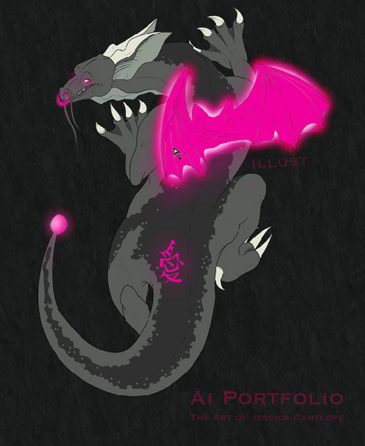
For my first Interactive Design final, I wanted to make a portfolio that I knew no one else in class would attempt — a very visual, cartoon-animation-based one. The unnamed dragon with softly glowing pink parts — let’s just call her “Ai”, since she has that kanji carved into her side — responds to link hovers depending on the pink part at which you point. When you click on one of them (hover tells you where you’re headed), she crawls out of the way so you can see the site content.

All that was drawn digitally with a Wacom tablet and Painter 7, with thumbnails set up manually and full pictures loaded in dynamically. Compared to the relatively automatic nature of loading images into my portfolio here on this site, it sure was time-consuming. These were my fledgling days of Flash, though, and while I’m over Flash now, I can still remember the excitement. It laid a framework for my desire to code beautiful websites.
In some ways, until this new site, this iteration of my portfolio was the easiest to navigate, or at least gave the most information directly (once you knew what to do). No nebulous floating icons, and no squashed information. Still, you might get sick of the music.
“Ai” (愛), by the way, was the first (and still registered) name of my design company. It’s the Japanese word for love; sometimes I still use it to refer to my old doodleblogs, and I still have a lot of business cards with “Ai” on them…
The Second One: Spring 2008
This is my graduation portfolio — another Flash-based piece that earned me one of my two local student silver Addy awards.
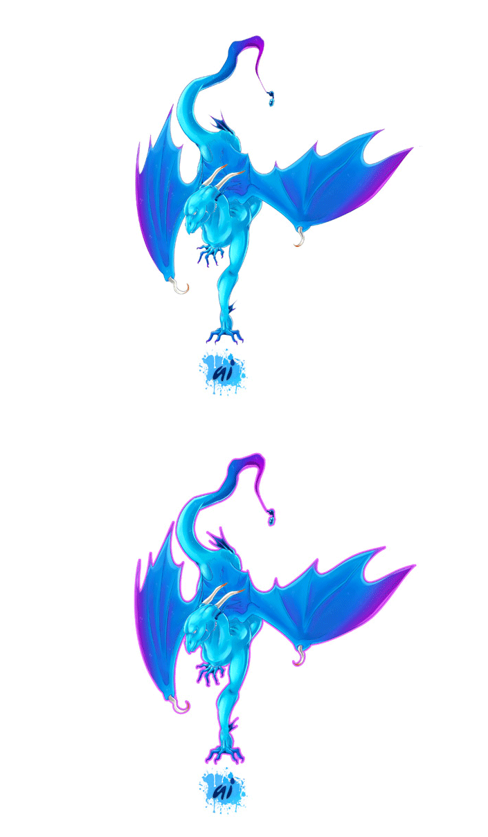
…Except when you visited this site, you saw this image first. And if you weren’t savvy to cursor changes on hover, you probably wouldn’t have known to click to enter the site. The pink outline on hover was only added a couple years later. Once you were in the site, things were fine, so long as you didn’t scroll too far up or down — I never did figure out that navbar functionality in Flash 8.
Nonetheless, this award-winning site of mine, though small and Flash-based, is nice to look at. Hover a link and the dragon’s head follows your cursor as you navigate. Click one and his bare sketch flashes before you for a brief few seconds. And my best work of the time features there.
Looking back, updating the site was a lot of work. There was a manual “lightbox” and a lot of images to load. It was almost like coding my own jQuery plugin, but in a dying language. This predated the popularity of jQuery, however, and the rise of easy-to-publish blog systems, unbeknownst to me, had only just started. Before I knew it, I had outgrown this site, and while sentimentality allows me to keep all of these online, I must move forward.
The Third One: Summer 2011
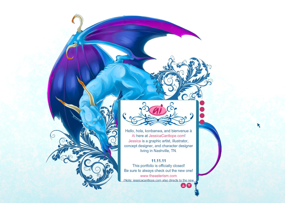
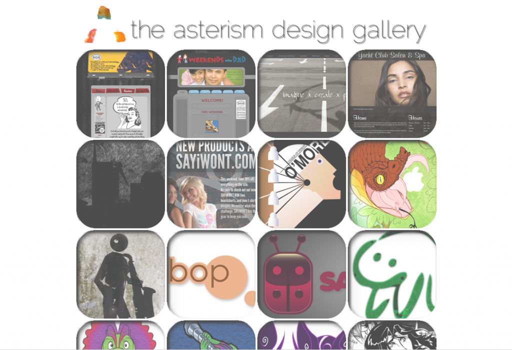
The third iteration of my portfolio is simpler than before — and, finally, not Flash-based. This website is actually still live right now, but due to be relaunched into a simpler one-page design sometime in the next several weeks — the link goes to its eternal resting place.
This came after a long road of fishing old websites out of HTML4 cobwebs and polishing them up like new. With further developed skills in web design, I found myself picky, yearning for a simplicity of which I wouldn’t tire easily. That’s why this site features two pages: one with a simple rotating image, another with the gallery.
However, I’m pretty sure no one knew that the flourishes on the front page also advance the rotating images (hover highlights them, but there’s certainly no way to tell on touch devices), and the question mark button that leads to further expanding information — like what this site is, résumés, accolades, links to other projects and social media, and etc. — is very easily overlooked. Some things can be a little too simple.
Which leads to this website…
Present Day
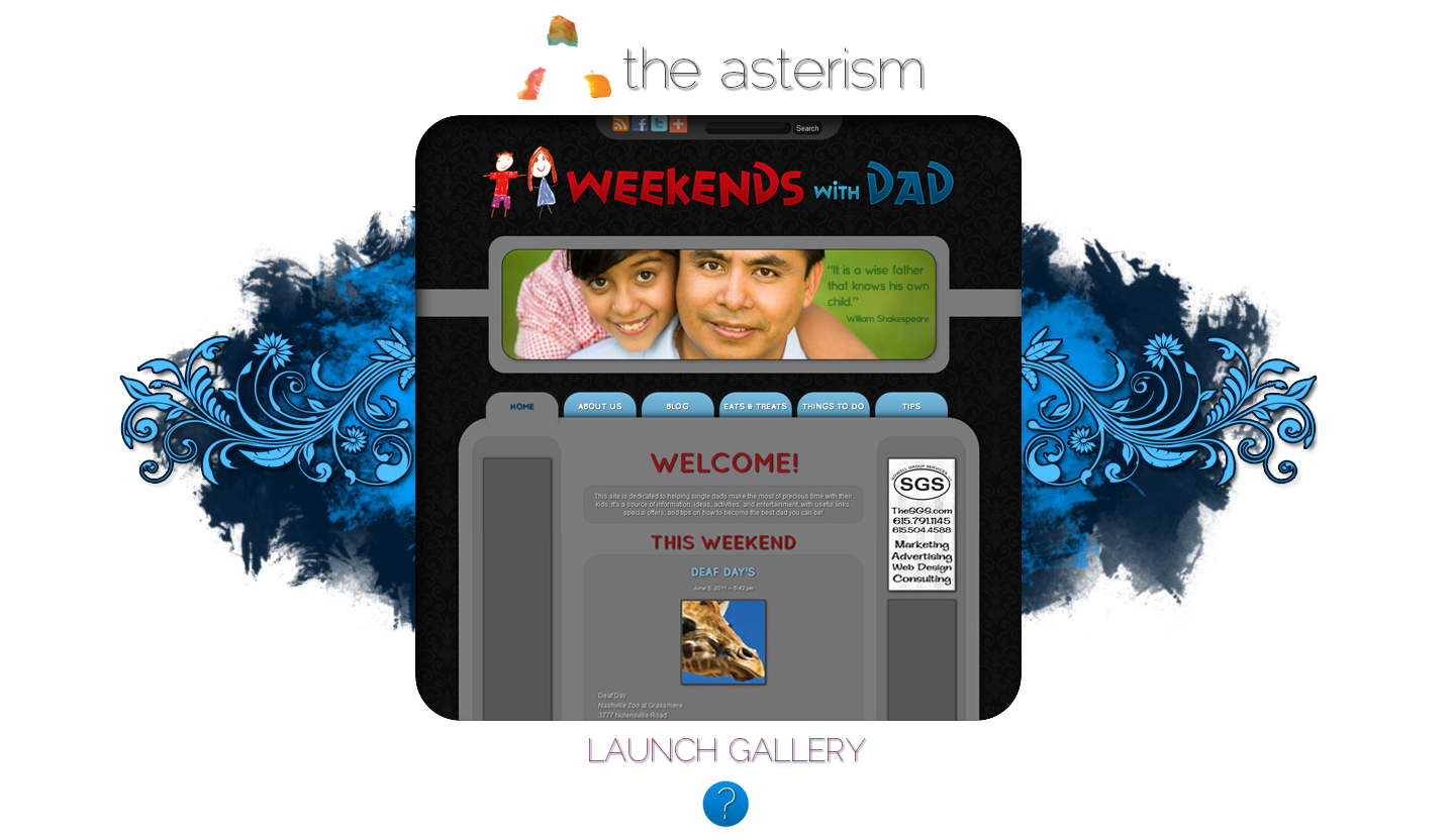
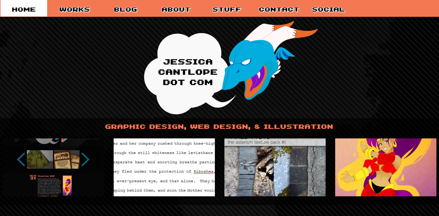
Of course, this is the first time my studio website and personal name have been split, freeing the studio to be as simple as it needs to be, and allowing there to be more content here — including a blog! And, best of all, this site gets to keep the dragon.
Zanoi (pronounced “sahn-wee”), who I’ll be introducing soon, has been the “guardian” of my portfolio sites since 2008. As a character, he’s a gateway-keeper, a trickster, and an ice dragon. Only his eventually-to-be-animated head features in the svg header of this blog, but his visage leaves an impression. Perhaps you’ll meet more of my characters on this blog as well. (By which I mean you will definitely meet more of my characters on this blog.)
This blog layout was designed to be fluid and accommodate different screen sizes, including larger ones. It’s designed to emphasize content and lacks sidebars, as I hate sidebars. Things are organized in such a way that the viewer can easily find a category of topic to browse — and I can easily update those categories. Plus, there are several nice visual features for those using modern browsers; check the project link for more on those.
That’s It?
Yep! I haven’t updated my portfolio a lot since I started it, but that’s about to change. It’s now easier than ever to create and maintain a website — especially a blog whose theme I designed myself. Keep your eyes peeled for more from me!

