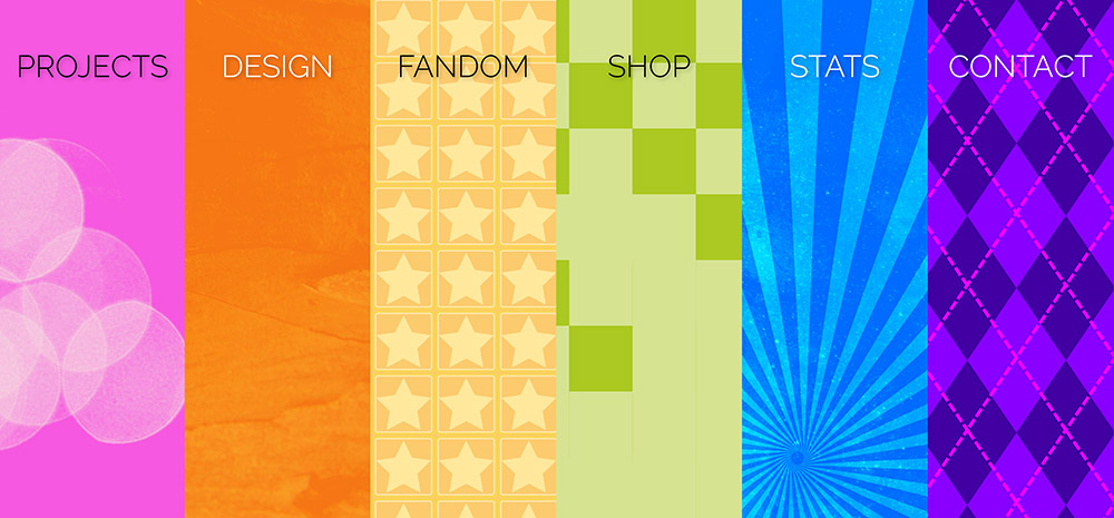
I have a personal hub for my online sillies, and it looks something like this! Each section, when clicked, expands full-page to display different info and links. Because I don’t need Carrds! I can make my own!
It’s also an experiment with texture and contrast in web design, which is an ongoing challenge with regards to accessibility.


