My time working with HCA Healthcare Information Technology & Services has had me edit hundreds of healthcare websites in the span of two years. Most of it has been migrating text and image content, either from a previously-existing website or from provided Word documents, PDFs, and attachments for new sites in dotCMS. Many more have me placing or creating logos, stock photography for headers, widgets, or editing and uploading provided photography from the practices. While my role there doesn’t officially involve designing or development, I often communicate with designers and developers to better the site and assure quality, implementing site content to their specifications and standards. I also make CSS or HTML changes when necessary. I have learned a lot about web design, accessibility, responsive design, and more over the process of interfacing with the different web design frameworks and internal web standards that have developed over the years.
At the top there is one of my favorites, Congenital Heart Surgery Center. This website has a creative, colorful, and context-appropriate web design. Referring to its designer comp, I implemented images and edited the background pattern, placed content, and made sure that code and content was implemented properly so things displayed as they should.
Also among my favorite sites I’ve worked on at HCA Healthcare are…

For Wesley Medical Center, I primarily reformatted rotator images from the old Framework 1 version of the site, as well as implemented sidebar content. I also did some website QA. I am a fan of its solid color scheme (grays and reds are my personal favorite).

On Methodist Physician Practices, the first major Framework 2 website, and a major umbrella, my main duties were creating rotator images out of the photography provided for each practice. Taking some direction from resident designers, I composited and edited practice photos with stock photography for rotators as well as migrated content — web page content, services, physicians, and etc. — for all the locations on the website. I like the branded color change for each practice within the site.
Northwest Florida Heart Group was one of the first Express sites I worked on. This type of site has a standard, fast creation and implementation method, with the most time potentially spent on gathering and formatting images for the website (most notably for the header area). I have contributed to the development of these sites by designing an entry for online bill-pay in the featured card-style sidebar snippets.

Working closely with practice and project managers, I migrated content to Rocky Mountain Orthopedics, merging four previously separate practices and determining how the information should be restructured. I made style and content placement decisions based on the comp and initiated feedback with the designers to revise it for newly-developed needs. I was concerned with maintaining the youthful look of the site as content was placed. My work also involved a large degree of CSS editing, widget implementation, and image-searching.

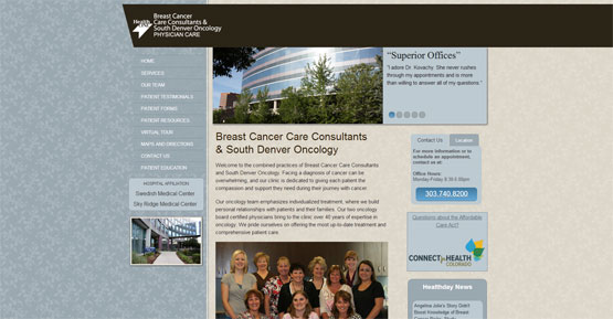
On top of the integration of content and images, I worked with others on Breast Cancer Care Consultants to make a familiar template feel more comfortable and welcoming to its target demographic by adjusting color scheme. A noted addition that I liked, deviating a little from the usual template, is the presence of texture. Also noted: the complete absence of pink.


