I love resources that make my life easier. To that end, I found out about Style Tiles right around the time I needed it: a website I was working on at the time no longer required the large, fully-laid-out Photoshop comp file of the past. A more unified, template-based system was being put in place (it seems this is the way of the web now), so simpler, thematic suggestions became more relevant. Then a coworker introduced me to…
Style Tiles are a design deliverable consisting of fonts, colors and interface elements that communicate the essence of a visual brand for the web.
They help form a common visual language between the designers and the stakeholders and provide a catalyst for discussions around the preferences and goals of the client.
Think of it like a much more useful vision board. The template can be modified with colors, fonts, logos, relevant imagery — you name it. It’s a concise way to lay out a brand image in several different arrangements for spec’s sake.
It’s best as a concept to start from oneself, however: working from the provided Photoshop template can be a little cumbersome. (There are a lot of layers that aren’t organized in a way I like.)
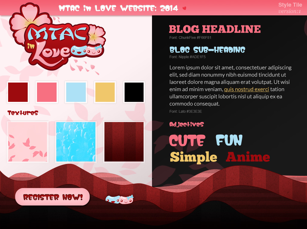
Here’s an example of a Style Tile in action. I didn’t actually use this in the beginning, but it could’ve been used for MTAC’s 2014 website, rather than the full design I originally started with:
I’m grateful to Samantha Warren for the idea; it helped me to put certain projects in perspective.